UX + UI DESIGN • BOOTCAMP PROJECT
Z Energy
Redesign of Z Energy's Station Locator Page.
Project Duration 🕗
2 weeks
The Problem
Users who frequently travel New Zealand are looking for a solution for an efficient journey planning experience. The current Z Energy station locator shows visible frictions that are highlighted in the following concerns:
Filtering for stations services feels unintuitive and unorganised
Users end up visiting multiple sites to compare fuel prices which is time consuming
No fuel indicators on each stations to let users plan their trips efficiently
UX Audit
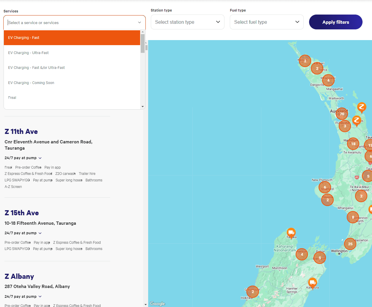
Our first mile journey started with a UX audit on the current Z Energy station locator system. Using heuristics evaluation, we have identified areas for improvement to enhance its experience in the following areas:
1
2
3
1
Services are unorganised where some it can be easily missed or know what’s it about. What's F’real? 🤔
2
Services drop down closes when choosing 1 type of service. Choosing multiple services can get quite annoying as you need to keep re-opening the drop-down
3
“Tags” need to be more prominent to be easily identified
Research, Ideation, & Design
Our team wanted to create a solution that would help the users have an efficient travel plan and can be used on everyday life.
We conducted a few ideation sessions and had multiple design concepts where we chose based on their importance, the time needed to complete, and impact.
For our first iteration, we've decided to proceed with these design concepts 👇

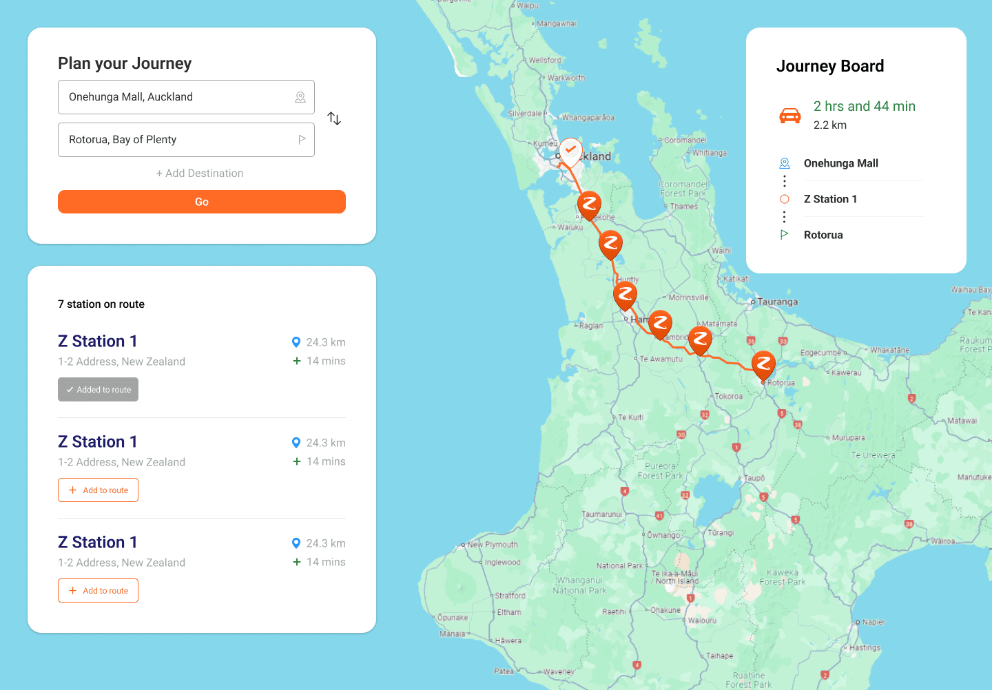
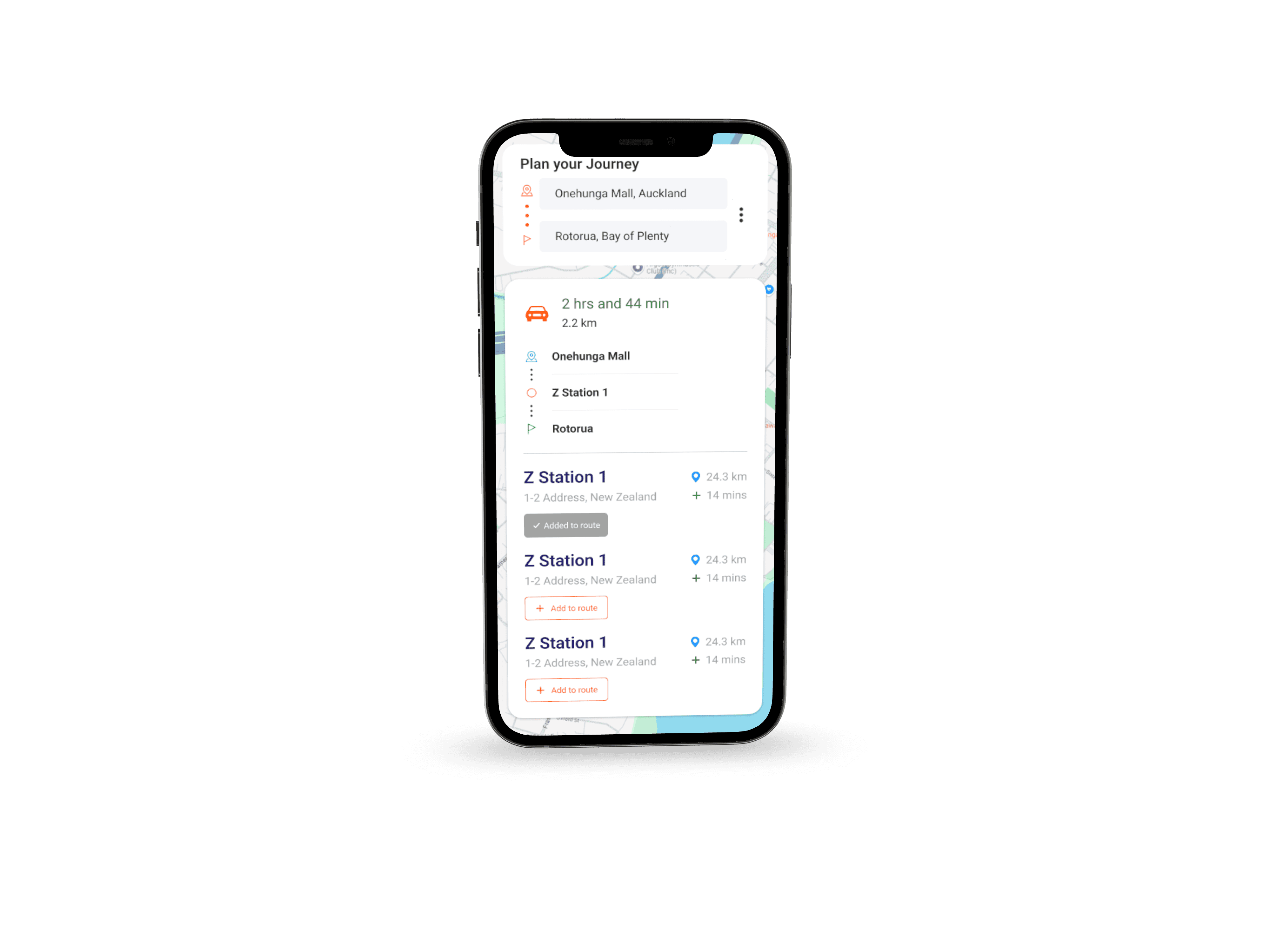
Journey Planner
A journey mapping application such as Google maps is one of the most helpful ways to plan out a trip. What better way to improve it by marking gas stops along your route and plan out more efficiently.
Services Filters
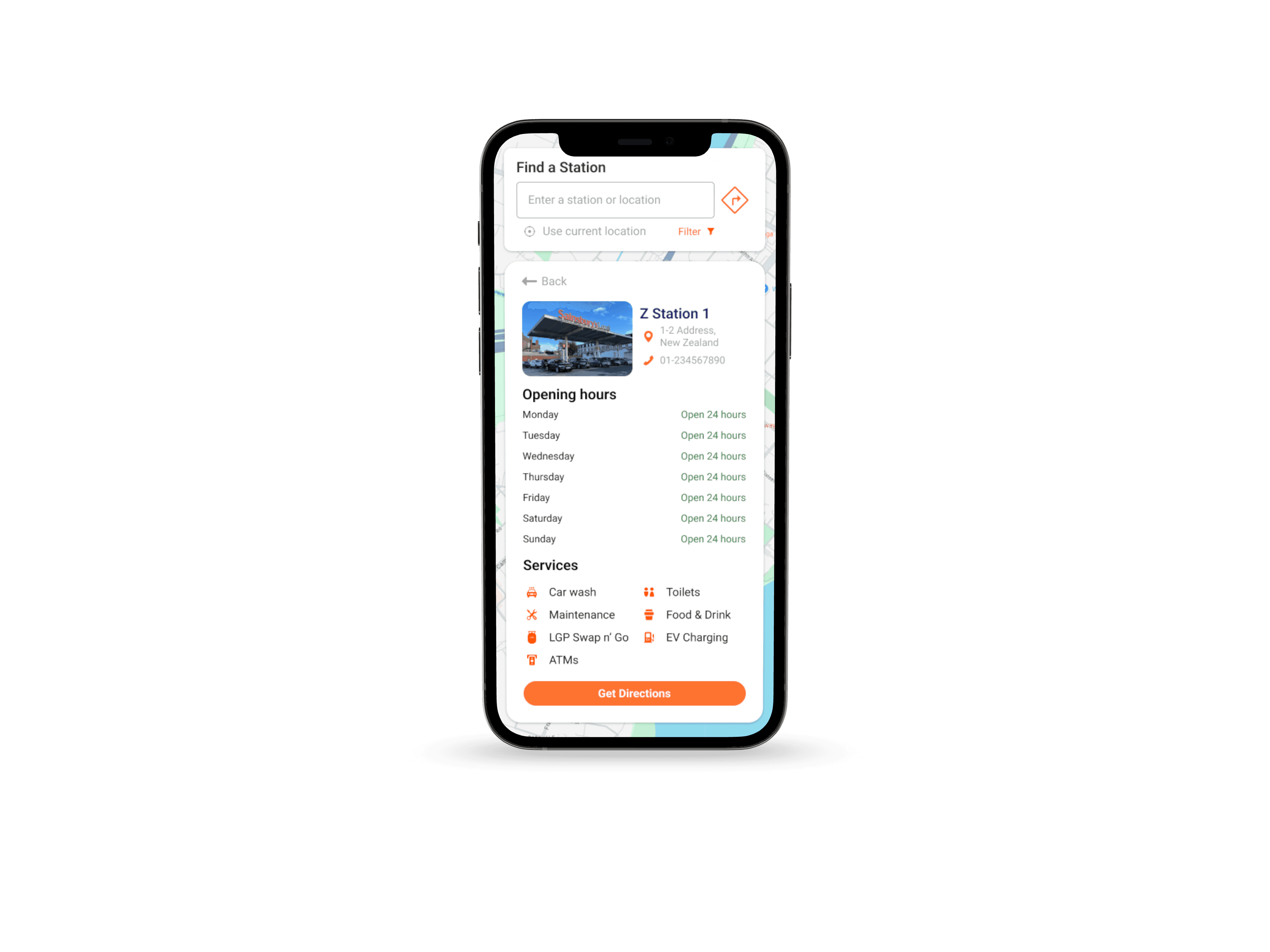
With the original UI kept, this gave us the opportunity to categorise the services more clearly. Researching more about Z Energy gave us more details as to what type of services they offer. (Turns out, F'real was a Milkshake)
UI Adjustments
After the evaluation, the team discussed whether we had to change the UI drastically. For our first iteration, we have decided to keep the original layout and make changes only as when needed.
Usability Testing
3 participants
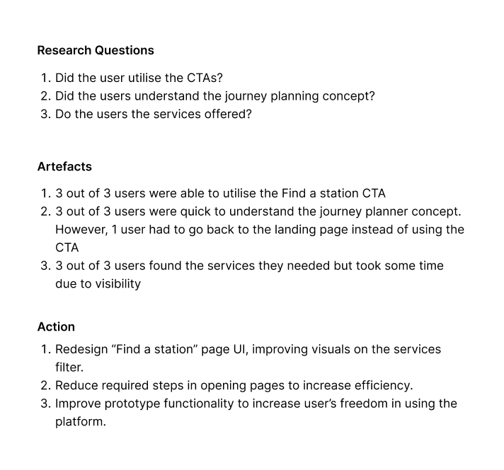
Our team conducted user tests to evaluate our design system. Our testing script consisted of "what would you do" questions to simulate a user's action based on the given situations.
With the usability testing, we had collected artefacts that we've used to make changes on our first iteration.
Final Design
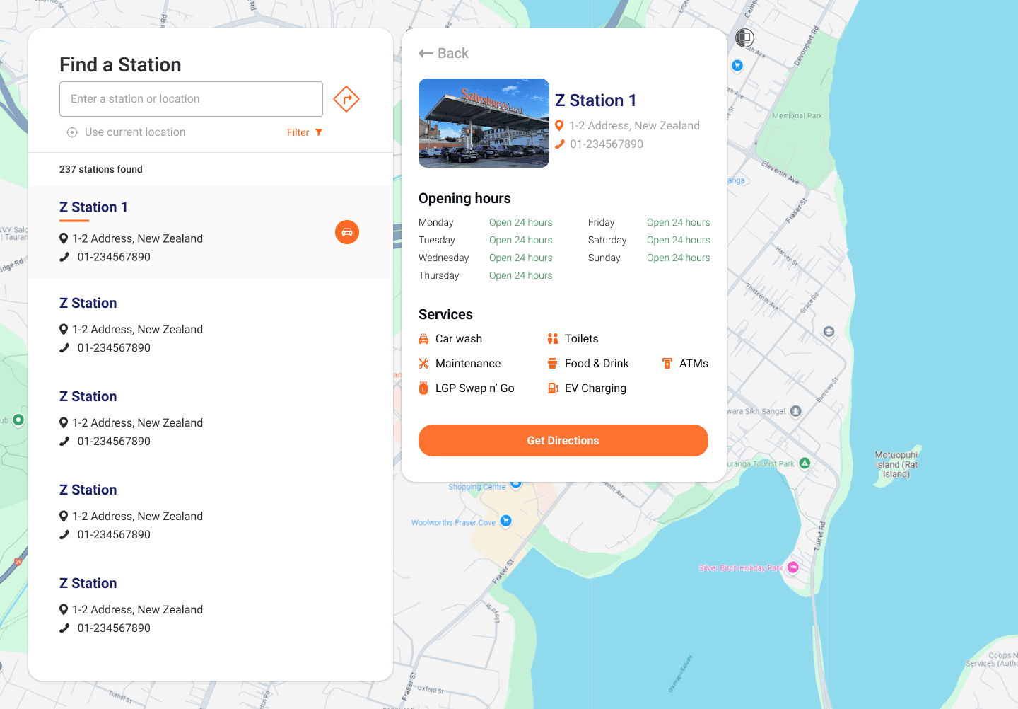
Station Locator & Journey Planner

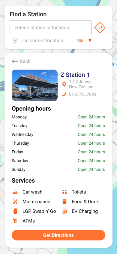
Mobile
Key Takeaways
Despite being a bootcamp project, this project gave me the opportunity to work on an actual case study where I learnt the responsibilities of a designer.
Furthermore, a few takeaways from this project are 👇
Focus on building an MVP
There is only so much time and effort that you can invest in a redesign. So it's important to focus on the features that can deliver the highest value for your users.
Design Overthinking
There had been a few encounters where we thought this feature might be a good idea and not at the same time. Discussing it with the team certainly helped by addressing potential concerns.
Time-Management
Each sprint duration varies from project to project, when it comes to designing, it is important to be mindful of the time required to complete a design. Taking a complex design with little to no time might lead to a disaster.
Eldrick 2024